

Side-by-side: how macOS app icons changed from Tahoe to the next beta
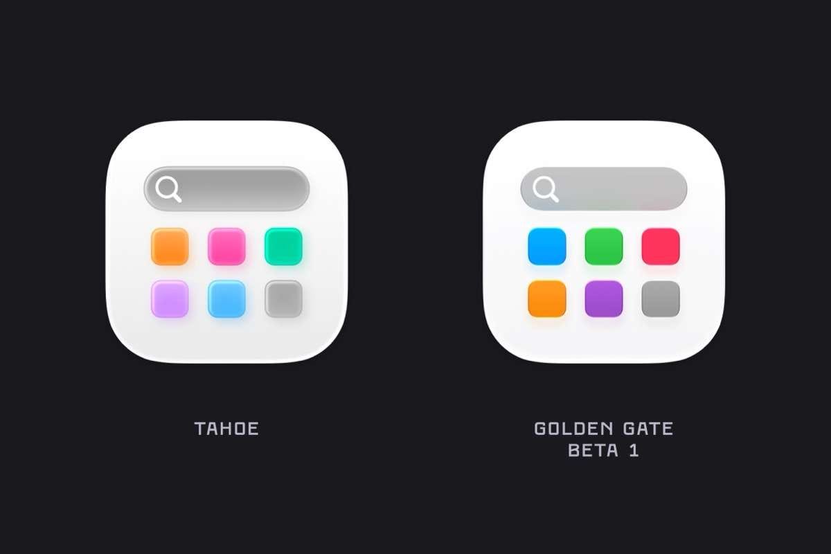
Apple keeps tinkering with the “Liquid Glass” look it introduced in macOS Tahoe, and designer BasicAppleGuy has lined up dozens of system app icons from the latest beta (codenamed Golden Gate) next to their Tahoe versions so you can see the changes.
The colors are bolder, the icons look sharper, and the glassy refraction effect has been reworked — most v…