

Mixed reviews for Instagram's new logo
Adam Mosseri unveiled the geometric sans-serif wordmark, but commenters read it as "instagzam" and Ars Technica called it AI slop.
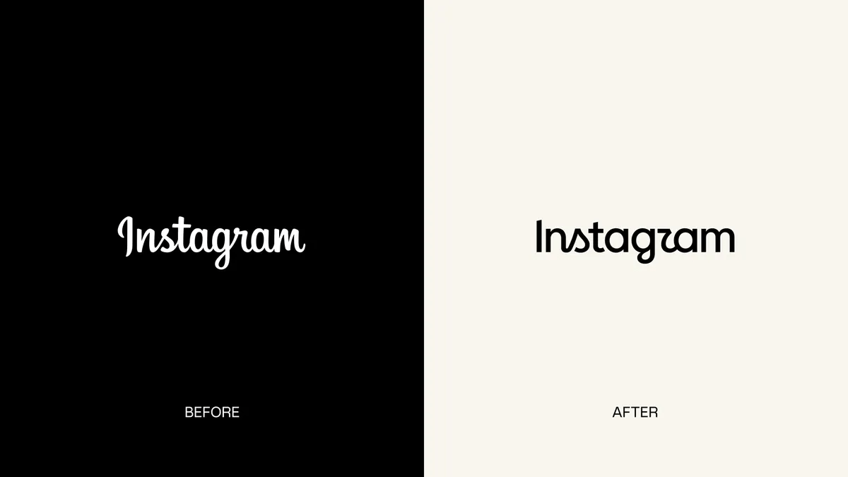
Instagram has rebranded with a new logo, and it's gone in the direction so widely-disliked it had supposedly went out of fashion years ago: geometric sans-serifs. Instragram boss Adam Mosseri explains.
The wordmark at the top of the app hasn't changed in 10 years, so it was time for a refresh. Cleaner and more modern, with references to the original and …