

Cracker Barrel to return to old logo after Trump "weighs in"
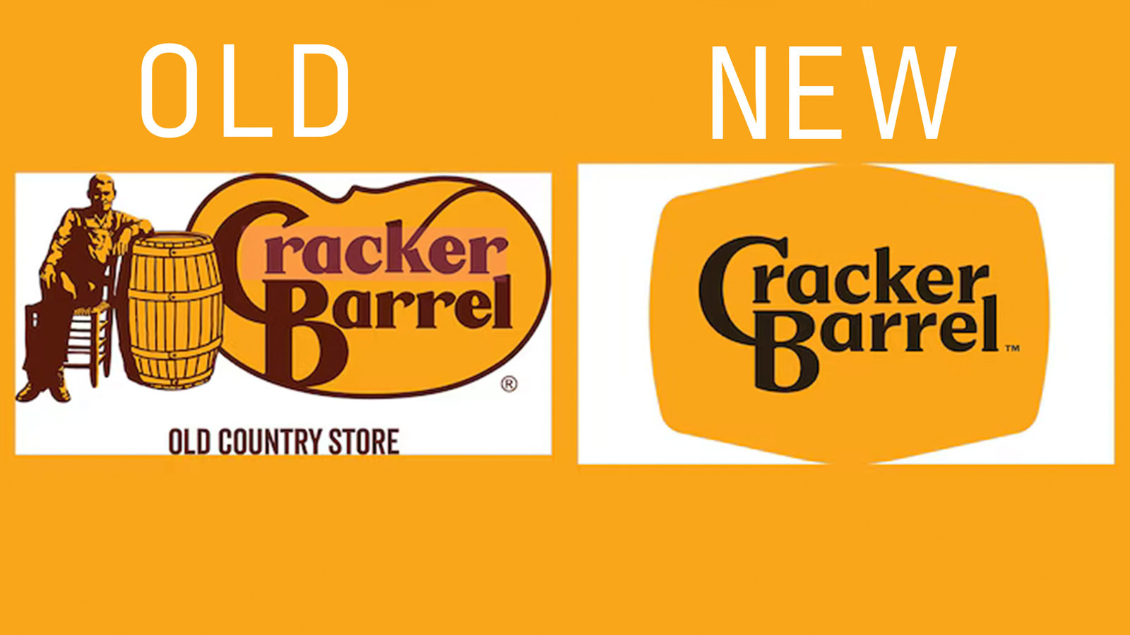
Cracker Barrel recently unveiled a simplified logo that tried to split the difference between modernization and tradition: they kept the old timey font (no blanding) but lost the fiddly art of an old guy. After thinking about it for a while, Conservatives reacted with strategic fury, calling the new design "woke." Cracker Barrel, desperate to…